Welcome to Flutebyte Technologies
In the fast-moving world of the internet, one thing’s always true—change is constant, especially when it comes to modern website design. What looked sleek and cutting-edge yesterday might feel outdated today. As we dive into 2025, the way we think about websites is shifting once again, becoming more imaginative, more efficient, and way more focused on the user experience.
From tiny, thoughtful type choices that quietly shape how we feel, to bold hero images that stop us in our tracks, today’s design trends go far beyond just looking good—they influence how people connect with a brand. And when that connection is strong, the impact is huge.
In this guide, 120 Modern Website Design Inspirations, we’re diving into some of the most exciting, forward-thinking design approaches shaping the web this year. Whether it’s minimalist layouts, playful interactivity, or color palettes that reflect culture and emotion, these ideas aren’t just trends—they’re tools to help you tell a more compelling digital story.
By the end, you’ll have a full spectrum of inspiration and actionable ideas to elevate your own site-no matter your style or niche.
Table of Contents
1. Introduction to Website Design Trends in 2025
Before we dive into specific design elements, it helps to understand why staying attuned to design trends is so crucial. With attention spans growing shorter, competition getting fiercer, and mobile usage skyrocketing, your website is more than a digital business card; it’s a portal to your brand’s identity.
Why 2025 Is a Landmark Year for Web Design
- Cutting-edge technologies: Virtual reality, advanced 3D modeling, and AI-assisted design have reached new levels of accessibility, allowing for richer, more interactive experiences.
- Enhanced connectivity: Faster internet speeds and more robust mobile networks enable high-quality images, animations, and real-time interactions.
- User expectations: With competition at an all-time high, visitors expect immediate load times, intuitive navigation, and visually gripping interfaces.
What It Means for You
If you’re a business owner or a freelance creative, these changes point to one major takeaway: those who stay current with design trends are more likely to engage their audiences meaningfully. Ignoring new possibilities—or sticking to methods that might feel outdated in today’s climate—can lead to lost visitors and diminished credibility.
2. Minimalist Design Approach
One of the more subtle yet significant trends in 2025 is the return to minimalism, but with a twist. While minimalist web design has been around for years, its use in 2025 goes beyond aesthetics by prioritizing function, clarity, and user experience.

- Made by: eCommerce platform
- Category: art
Foundry: Harnessing Negative Space and Monochromatic Schemes
A great example of minimalist design done right is Foundry. Their approach focuses on negative space to provide breathing room around essential content. By doing so, each element on the page stands out, capturing the viewer’s attention with minimal distractions. They often work with monochromatic color palettes—white, black, or variations of gray—to cultivate a refined look. The result is an elegant interface that feels both sleek and inviting.
Key Benefits of Negative Space and Monochrome
- Easier on the eyes, reducing cognitive load.
- Promotes clarity, making calls to action more prominent.
- Builds a sense of harmony and consistency throughout the site.
Embracing Flat Design Principles
Within minimalist design, flat design remains a go-to strategy for interface elements. Flat design avoids gradients, shadows, and intricate textures, relying instead on clean lines and simplified shapes. This creates a modern, streamlined aesthetic where each visual piece has a role.
Why Flat Design Matters in 2025
- Faster load times: Fewer complex graphics mean quicker page rendering.
- Responsive harmony: A flat layout adapts smoothly to varying screen sizes.
- Contemporary appeal: Audiences tend to view flat design as fresh and approachable.
3. Effective Use of Hero Images
If there’s one element that has the power to instantly grab a visitor’s attention, it’s the hero image. In 2025, hero images are not just bigger and bolder; they’re more strategic.

- Made by: WordPress content management system
- Category: fashion and apparel
Supima’s Attention-Grabbing Images
Take a page from Supima, a brand renowned for harnessing hero images that command attention. Their images often highlight key brand values or flagship products while leaving enough surrounding space to make text overlays pop. By blending these compelling visuals with negative space, visitors aren’t overwhelmed by competing design elements the moment they land on the homepage.
Practical Tips for Captivating Hero Images
- Opt for high-resolution photos that resonate with your brand’s message.
- Use minimal text or concise calls to action that align with the visual.
- Ensure fast loading: Compress and optimize your hero image for different devices without losing quality.
4. Innovative Navigation Structures
Navigation is often underappreciated until it frustrates the user. In 2025, designers are exploring novel ways to guide visitors through a site without sacrificing clarity.
- Made by: drag-and-drop website builder
- Category: creative
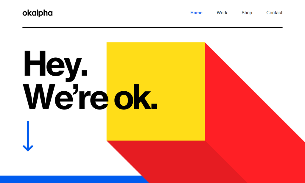
Okalpha’s Unique Navigation
A fascinating example is Okalpha. Instead of a standard top bar or hidden hamburger menu, they might employ a side-scrolling navigation or an interactive timeline layout. These non-traditional techniques give users a sense of discovery while still offering straightforward ways to find information.
Why Experiment with Navigation?
- Boosts engagement: Unique interfaces pique curiosity.
- Enhances brand personality: Innovative menu layouts can convey creativity or boldness.
- Improves user flow: Done correctly, it can prevent confusion and reduce bounce rates.
5. Personal Branding Through Web Design
Freelancers, artists, and entrepreneurs increasingly use their websites as a platform to showcase personality and expertise. In many cases, visitors are as interested in the person behind the brand as they are in the product or service.

- Made by: Next.js static site Generator, CMS, web Framework, and web server
- Category: design portfolio
Rick Waalders’ Portfolio
Rick Waalders, for example, curates his personal site to reflect his unique style and skill set. Through carefully chosen color schemes, custom logos, and personal anecdotes, he demonstrates not only his technical prowess but also his creative vision and professional story.
How to Develop Personal Branding
- Use custom photography to show the real you, rather than stock images.
- Craft a compelling bio: Let your personal mission shine through.
- Highlight distinctive projects or achievements that set you apart.
6. Interactive and Engaging Elements
Static websites with blocks of text are quickly becoming a thing of the past. Interactive features offer a more playful, immersive way for visitors to get to know your brand.

- Made by: drag-and-drop website builder
- Category: travel and tourism
Mbau’s Interactive Experience
Mbau stands out for incorporating subtle animations and hover effects that respond to user actions. These micro-moments of delight keep visitors intrigued and encourage them to explore more pages on the site. From clickable pop-ups to animated infographics, every interaction feels purposeful and aligned with the site’s narrative.
Benefits of Interactive Elements
- Higher user engagement: Visitors stay longer when they can “play” with the site.
- Increased conversion: Interactivity can guide users effectively toward a call to action.
- Enhanced storytelling: Animations can illustrate concepts that text alone might struggle to convey.
7. Storytelling Through Design
Gone are the days when a website merely listed products and services. In 2025, users expect a cohesive brand story that resonates emotionally.
- Made by: Confluent and Next.js static site generator, CMS, web framework, and web server
- Category: beauty and lifestyle
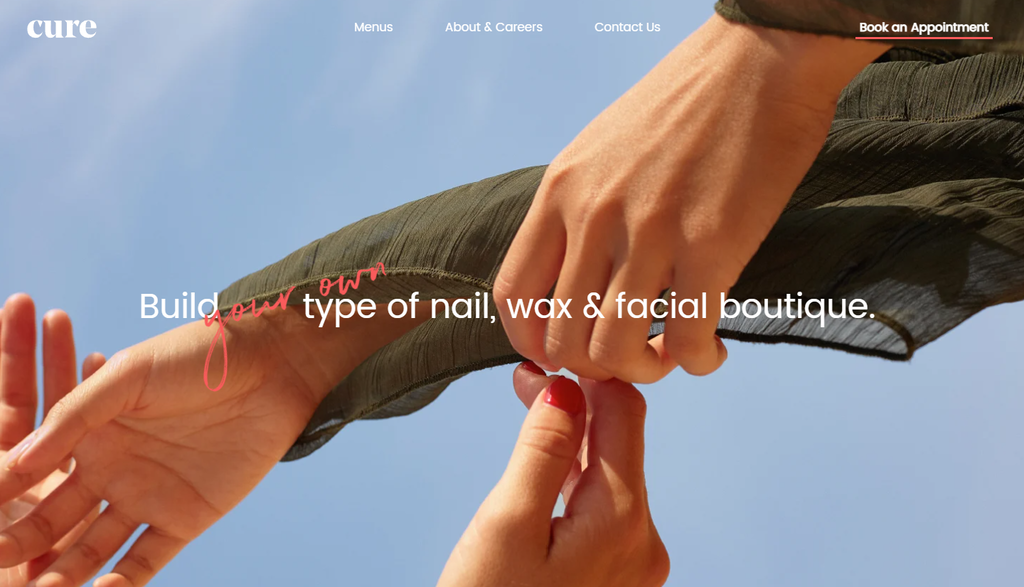
Cure Nails’ Narrative Approach
One of the most compelling examples is Cure Nails, which uses consistent design language—colors, fonts, and images—to reflect their brand identity and mission. Rather than simply selling nail products, they narrate their origin, goals, and values visually and textually, ensuring customers feel connected and invested.
How to Weave a Story into Your Website
- Organize content in chapters: Think of your homepage as the opening scene and subsequent pages as the plot.
- Use consistent themes: Your color palette, typography, and visuals should reinforce your brand narrative.
- Incorporate genuine testimonials: Let real experiences highlight your brand’s impact.
8. Combining Aesthetics with Functionality
A visually stunning website will only hold user attention for a moment if it’s not also easy to navigate and use. Striking the perfect balance between form and function is the hallmark of great web design in 2025.

- Made by: Next.js static site generator, CMS, web framework, and web server
- Category: education
Outreach Space: Where Design Meets Utility
Outreach Space exemplifies this fusion by ensuring that every design choice serves a purpose. Their layout seamlessly integrates essential functions like search and contact forms without disrupting the site’s visual flow. Buttons, icons, and imagery are meticulously placed to guide visitors while maintaining an appealing aesthetic.
Why This Matters
- Reduces friction: Visitors can find what they need without confusion.
- Enhances brand trust: Professional layouts convey seriousness and reliability.
- Improves retention: When it’s easy to move through a site, users stick around longer.
9. Use of Color Psychology
The importance of color in web design goes beyond mere decoration. Different hues can evoke specific emotions, influence perceptions, and even nudge visitors toward making decisions.

- Made by: custom-built
- Category: creative
Elva’s Strategic Color Palette
Elva provides a fantastic illustration of leveraging color psychology. Bright, cheerful tones might dominate the homepage if they want to establish an energetic brand aura. Conversely, they employ muted, comforting shades if the goal is to create a calm, professional feel. Each color aligns with the intended mood and function of the page.
Considerations for Effective Color Usage
- Know your audience: Choose colors that resonate with your demographic and brand identity.
- Maintain consistency: Use a primary palette throughout the site; accent colors can highlight calls to action.
- Evaluate readability: High contrast between text and background is crucial for user accessibility.
10. Typography as a Design Element
Typography is more than a vehicle for words; it can be a visual statement that underpins your brand’s voice. In 2025, designers are experimenting with bold, custom typefaces to command attention.

- Made by: drag-and-drop website builder
- Category: creative
Motion’s Striking Typography
The site Motion leverages oversized typography in headers, combining it with clean, readable body text for a balanced look. Bold letters may overlap visuals or transition dynamically into another section. This synergy between typography and imagery underscores key messages and adds a layer of sophistication to the website.
Tips for Effective Typography
- Pair fonts wisely: A bold display font for headings and a simpler typeface for body text can look polished.
- Use hierarchy: Make sure headings, subheadings, and body text are clearly differentiated.
- Mind readability: Even if you choose a more artistic font, it must remain legible across devices.
11. Incorporating Multimedia Content
Multimedia elements like videos, animations, and audio can spark immediate engagement and cater to various learning styles. However, oversaturation can slow down your site and overwhelm visitors, so striking a balance is key.

- Made by: Craft CMS and Yii web framework
- Category: health and wellness
Swab the World’s Interactive Videos
Swab the World harnesses high-quality videos and animations to illuminate critical points of their cause. These elements load efficiently, ensuring visitors don’t suffer from extended wait times. The videos themselves are concise yet impactful, weaving seamlessly into the site layout without overshadowing other content.
Multimedia Best Practices
- Optimize file sizes: Compress videos and use streaming platforms or content delivery networks (CDNs).
- Place them strategically: Feature videos where they add the most contextual value.
- Provide controls: Let users play, pause, or skip content to suit their preferences.
12. E-commerce Design Strategies
With online shopping more popular than ever, e-commerce sites must focus on frictionless user experiences, from product discovery to checkout.

- Made by: WordPress content management system and WooCommerce
- Category: accessories
AARK Collective’s Seamless Shopping
One brand that nails e-commerce design is AARK Collective. They maintain a visually cohesive product grid, highlight essential features upfront, and offer a swift, secure checkout process. Every product page keeps the shopper informed while guiding them toward a purchase decision with minimal fuss.
Essential E-commerce Elements
- Quick loading product galleries: Slow loading times can lead to immediate bounces.
- Clear calls to action: Use conspicuous “Add to Cart” or “Buy Now” buttons.
- Transparent policies: Display shipping, return, and pricing details prominently.
13. Portfolio Presentation Techniques
For creative agencies, photographers, or freelancers, the portfolio is the heart of the website. Presenting work in a visually engaging manner can set you apart from the competition.

- Made by: WordPress content management system
- Category: creative
Beauvoir’s Innovative Showcase
Beauvoir excels at showcasing their creative projects through immersive previews, dynamic grids, and interactive case studies. Each portfolio piece features well-structured narrative elements: the challenge, the approach, the outcome. This storytelling format gives prospective clients deeper insight into the agency’s capabilities.
How to Elevate Your Portfolio
- Curate selectively: Only include your best, most relevant work.
- Use descriptive narratives: Outline the context of each project to highlight your problem-solving skills.
- Engage with visuals: Embed embedded videos, interactive elements, or before-and-after sliders.
14. Responsive and Mobile-Friendly Design
With mobile traffic continuing to outpace desktop in many industries, ensuring a consistent user experience across all devices isn’t optional—it’s imperative.

- Made by: drag-and-drop website builder
- Category: art and home decor
Roee Ben Yehuda’s Mobile Approach
The designer Roee Ben Yehuda has mastered the art of responsive design, offering layouts that adapt gracefully to phone screens, tablets, and high-resolution monitors. Whether you’re on a small smartphone or a giant desktop monitor, the content, images, and navigation shift fluidly, preserving both visual appeal and usability.
Core Principles of Responsive Design
- Fluid grids: Use relative units (like percentages) for layout elements.
- Flexible images: Let images scale within their containers to avoid cutoff.
- Mobile-first strategy: Design for the smallest screen first, then progressively enhance for larger displays.
15. Dark Mode Implementation
Dark mode has transcended fad status; it’s a practical, user-endorsed feature that eases eyestrain and saves battery life, particularly on mobile devices with OLED screens.

- Made by: Next.js static site generator, CMS, web framework, web server
- Category: photography portfolio
Darc Room’s Moody Aesthetic
Darc Room wholeheartedly embraces dark mode, giving their site a sleek, mysterious ambiance that fits their brand identity. Titles, images, and icons glow against the dark background, increasing contrast and readability while remaining visually striking.
Implementation Tips
- Test readability: Light text on a dark background needs proper contrast for legibility.
- Offer a toggle: Let users switch between light and dark modes to accommodate preferences.
- Maintain brand identity: Your dark color palette should still align with your brand’s core style.
16. Use of Asymmetrical Layouts
Symmetry in web design offers stability, but asymmetrical layouts can infuse a sense of spontaneity and depth that grabs user attention.

- Made by: drag-and-drop website builder
- Category: creative
Appart Agency’s Dynamic Composition
Appart Agency employs asymmetrical grids, layering text and images in visually compelling ways. Rather than rely on the conventional left-to-right alignment, they might offset images, overlap content boxes, and play with scale. This keeps visitors visually engaged while navigating the site.
Why Asymmetry Works
- Adds energy: Breaking from a standard grid feels fresh and dynamic.
- Guides the eye: Intentional placement of elements can lead the viewer’s gaze across the site.
- Stands out: Many websites still use symmetrical layouts, so asymmetry can differentiate your brand.
17. Incorporating Social Proof
The digital marketplace thrives on trust, making testimonials, reviews, and case studies vital to winning over new visitors. Thoughtful inclusion of social proof can dramatically improve credibility and conversions.

- Made by: drag-and-drop website builder
- Category: animal welfare
Critical Danger’s Testimonials
Critical Danger highlights customer testimonials prominently, ensuring any visitor curious about their offerings will see authentic reviews, client logos, or even user-submitted content. Each piece of praise aligns with the brand’s tone and addresses a different user concern or question.
Effective Ways to Add Social Proof
- Customer quotes: Display short, specific feedback about your product or service.
- Case studies: Offer deeper dives into problems solved for past clients.
- Real-time counters: Show how many users have signed up or purchased a product.
18. Microinteractions for Enhanced UX
Sometimes, it’s the smallest details that make or break an experience. Microinteractions—like subtle hovers, button animations, or progress indicators—add polish and can deliver feedback to users in an intuitive way.

- Made by: WordPress content management system
- Category: creative
Breakfast’s Subtle Animations
Breakfast introduces gentle, unobtrusive microinteractions that enrich browsing. Think of a button that gently shifts in color when hovered over, or a form field that vibrates slightly if filled incorrectly. These nuances not only help guide user action but also heighten the feeling of a responsive, dynamic website.
Implementing Microinteractions Thoughtfully
- Keep it simple: Overly complex animations can distract or confuse.
- Focus on feedback: Each animation should inform the user of a system status or next step.
- Maintain consistency: Use a cohesive motion design language across the entire site.
19. Cultural and Localized Design Elements
A one-size-fits-all approach to design can alienate audiences, especially if your brand operates across multiple regions or caters to a culturally specific niche.

- Made by: drag-and-drop website builder
- Category: food and dining
Magic John’s Regionl Focus
Magic John’s invests in local imagery, language nuances, and references that speak to their primary audience’s cultural background. By doing so, they create a stronger emotional connection and build trust quickly, as visitors feel acknowledged and understod.
Tips for Cultural Localization
- Use relevant cultural symbols or color schemes that align with the target demographic’s preferences.
- Adapt language: Ensure text is in the right dialect or offers translations for international audiences.
- Respect traditions: If cultural observances or holidays are important, reflect them in your design and content.
20. Fusion of Traditional and Modern Design
There’s a special sweet spot where classic design elements coexist harmoniously with modern techniques. This timeless-meets-contemporary fusion can appeal to a broad audience, from digital-savvy millennials to more traditional users.

- Made by: Express web framework and web server
- Category: creative
Studio Job’s Classic-Modern Blend
The website for Studio Job seamlessly integrates vintage-inspired typography and illustrations with modern animations and layout structures. This synergy pays homage to the past while keeping pace with current user interface expectations. The result is a brand identity that feels rich, eclectic, and forward-looking.
Finding the Right Balance
- Leverage timeless motifs: Classic serif fonts or hand-drawn illustrations can evoke nostalgia.
- Incorporate modern functionalities: Parallax scrolling, responsive design, and interactive elements maintain a contemporary edge.
- Ensure brand cohesion: No matter how eclectic the mix, each feature should still tie back to your brand’s identity.
Conclusion: Key Takeaways for Effective Web Design
The year 2025 ushers in an era of experimentation and refinement in the world of web design. Visitors expect speed, clarity, emotional resonance, and a reason to linger on your page. By absorbing the lessons from the websites mentioned throughout this article, you’ll be better equipped to craft an online presence that’s not only visually appealing but also deeply aligned with your brand’s goals and user expectations.
- Stay Updated: Web design trends shift rapidly. Regularly review your site’s design to maintain relevance.
- Embrace Minimalism: Negative space, flat design, and a streamlined interface direct user attention to key content.
- Leverage Hero Images: High-quality visuals paired with negative space can make a striking first impression.
- Innovate Your Navigation: Don’t be afraid to experiment, but always prioritize clarity.
- Showcase Personality: Whether you’re a freelancer or a global brand, personal touches can forge deeper connections.
- Interact and Engage: Subtle animations and interactive elements invite exploration and reduce bounce rates.
- Tell a Story: Whether it’s personal branding or a corporate narrative, story-driven design fosters emotional investment.
- Balance Form and Function: Aesthetics should never sacrifice usability and vice versa.
- Think Color Psychology: Align your palette with the feelings you want to evoke and your brand identity.
- Utilize Typography: Let your typeface reinforce the messages you’re conveying.
- Incorporate Multimedia: Videos, animations, and audio can bring depth, but be mindful of loading speeds.
- Refine Your E-commerce: Clean product displays and transparent checkout flows boost sales.
- Highlight Portfolios: Innovative layouts and strong storytelling can help you stand out in competitive fields.
- Go Responsive: Make mobile-friendly design a foundational practice for broader reach.
- Offer Dark Mode: Give users control and reduce eye strain, particularly in dim environments.
- Play with Asymmetry: Liven up a site with non-traditional layouts while preserving usability.
- Include Social Proof: Testimonials, reviews, and case studies can elevate trust and credibility.
- Use Microinteractions: Refine the user journey and add delight with subtle animated feedback.
- Localize Your Design: Consider cultural preferences and language subtleties to connect with diverse audiences.
- Blend Old and New: Merge classic design elements with modern techniques for a timeless yet contemporary feel.
By integrating these principles, you’re well on your way to creating a website that stands out in 2025 and beyond. It’s not just about looking good; it’s about delivering a holistic experience that your visitors will remember and want to return to. From balancing cutting-edge innovation to honoring timeless design philosophies, your site can become a digital cornerstone that both embodies your brand and engages your audience on a deeper level.
Remember, design is as much about the journey as the destination. Continually revisit and refine these concepts, staying tuned to emerging trends and technologies. With a thoughtful, strategic approach, your website can be more than just an online presence – it can become a compelling digital experience that captivates and converts.
FAQ
1. Why is staying updated with website design trends important in 2025?
In 2025, the digital landscape is rapidly evolving with advancements in technologies like virtual reality, 3D modeling, and AI-assisted design. Enhanced connectivity and rising user expectations mean that websites must offer immediate load times, intuitive navigation, and visually engaging interfaces to remain competitive.
2. What is the minimalist design approach in modern web design?
Minimalist design emphasizes simplicity by using negative space and monochromatic color schemes to highlight essential content. This approach reduces cognitive load, enhances clarity, and creates a harmonious and consistent user experience.
3. How does negative space enhance user experience in web design?
Negative space, or whitespace, provides breathing room around content, making it easier for users to focus on key elements without distractions. It improves readability and guides the user’s attention to important areas of the website.
4. What role do monochromatic color schemes play in minimalist web design?
Monochromatic color schemes use variations of a single color to create a cohesive and elegant look. They help in establishing a refined aesthetic that is easy on the eyes and promotes a sense of unity throughout the website.
5. How can businesses implement modern design trends to enhance user engagement?
Businesses can adopt modern design trends by focusing on user-centric designs, incorporating interactive elements, and utilizing culturally nuanced color choices. Staying updated with current trends and understanding their impact on user perception can lead to more engaging and effective websites.